Coverys Insurance
In 2022, Coverys provider insurance company wanted to become a thought leader, differentiate itself from competitors, and raise awareness of its inclusive DEI culture. The final recommendations we made were projected to improve engagement and conversions by ~15–20 %.
Audience: Policyholders, hospital administrators, agents/brokers, prospects, employees, and job seekers
Objectives: We wanted to promote the new agency products for differentiation, improve messaging about its inclusive culture, and strategize how to make the content more accessible and personalized to each audience.
Deliverables: Keep/Edit/Delete inventory of pages, content audit slide deck with findings and actionable recommendations.
Findings: My audit found that the site had relevant and high-quality editorial content, but the search tool lacked enough topics to be useful. There were a lot of content gaps, like DEI successes and new products. The content was not scannable and targeted a general audience, not distinct audiences.
Recommendations:
Strengthen the About section
To strengthen the client’s branding goals, I recommended adding content on their DEI efforts and work culture, a compelling mission statement, the community work the company does, and awards and accolades.
Strengthen social proof
I recommended they add testimonials to build social proof.
Showcase new products
I recommended they promote new products on the website to differentiate them from competitors and increase conversions.
Increase findability
With the UX team, I recommended they:
Expand filtering and cross-linking to improve findability.
Add a ‘Related Content’ component to help users find relevant content.
Build a taxonomy to make sure content is categorized logically and easy to retrieve.
Add more relevant topics to the thought leadership content search tool so content that was hard to find was more accessible.
What I learned
When it came to messaging DEI and work culture, sometimes the most obvious problems can escape the client. Pictures of the all-white board gave mixed messages and took up a lot of space so we recommended taking those off the site. Also, It’s easy to add content without thinking about readability, scannability, and digestibility. By recommending content models for blog posts, etc, we helped them improve the experience and SEO at the same time.
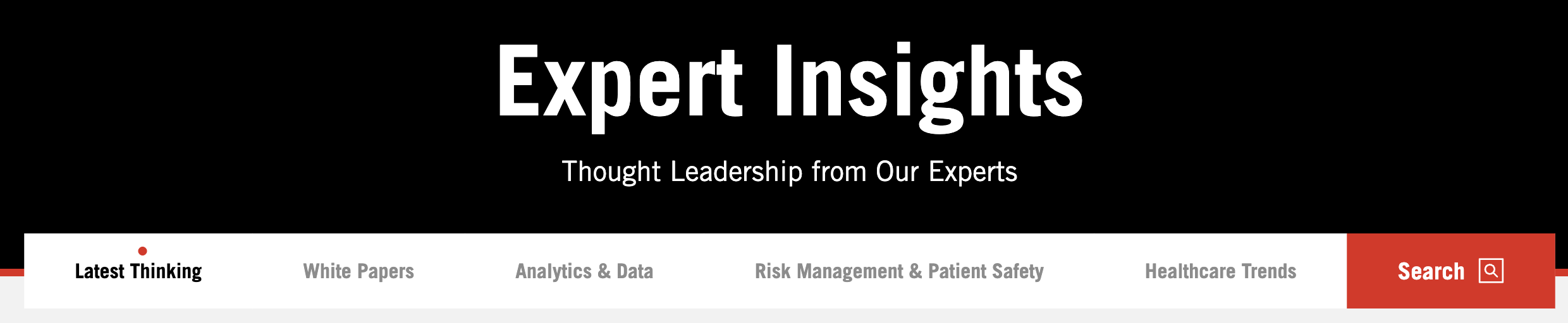
Expand Content Search Tool
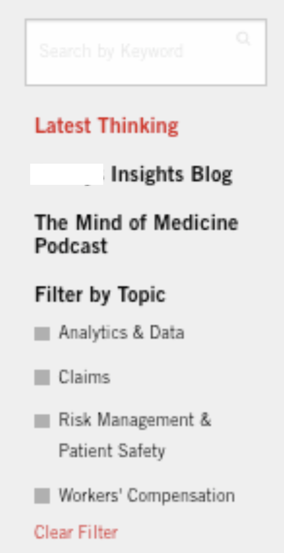
A major problem with findability on the site was that the content search tool had a narrow choice of topics to select from. I recommended they take out search topics that weren’t popular in their resource library and add topics that mattered to users and business goals.
Current improved content library has navigation menu with more relevant topics.
Increase Engagement
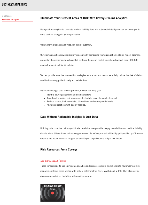
I recommended they make their content more scannable with photos, infographics, smaller paragraphs, more headers.
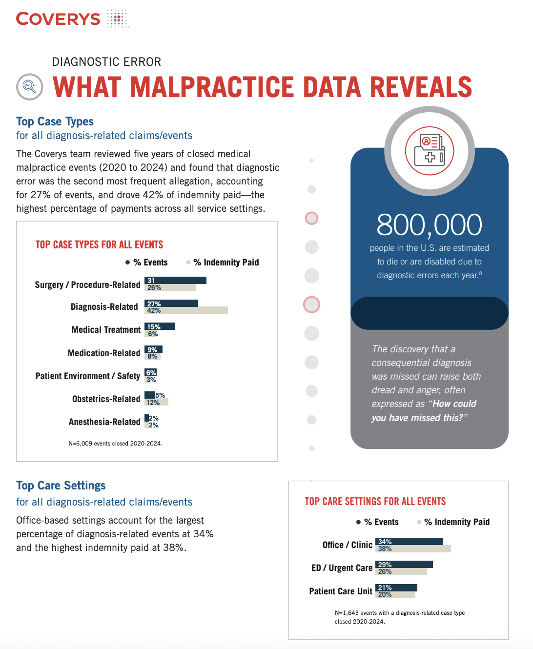
Current content is more scannable and engaging.