Content Strategy
I help clients have content with better findability, user engagement, and differentiation from competitors so they can better serve their audience. I’ve worked as a strategist for 3 years with MERGE, a marketing agency in Boston, and as a remote contractor. My clients include health systems (Atlantic Health System, Broward Health, IU Health, Sparrow Health, and UConn Health), Payors (GEHA, Coverys), and pharma/device enterprises (Supernus, Boston Scientific and Radius) and nonprofits (Stillwater Music).
Main areas of expertise:
Content audits
Competitive analyses
Editorial guidance
SEO and GEO analysis and strategy
Gen AI tools for content compliance, taxonomy, research, and inspiration
“Christine was such a pleasure to work with, and if given the chance, I couldn't be happier to work with her again. As a content strategist, Christine has an uncanny ability to connect with and thoroughly understand the needs of the end user. Paired with her willingness to openly collaborate with stakeholders and internal project teams alike has been a proven recipe for success in my opinion (and experience).”
Brandon Rumburg, Sr. Digital Project Manager, MERGE, Boston, MA
Wasted space in class display
Some images repeat and requires a lot of scrolling

No search tool
and redundancy in main nav
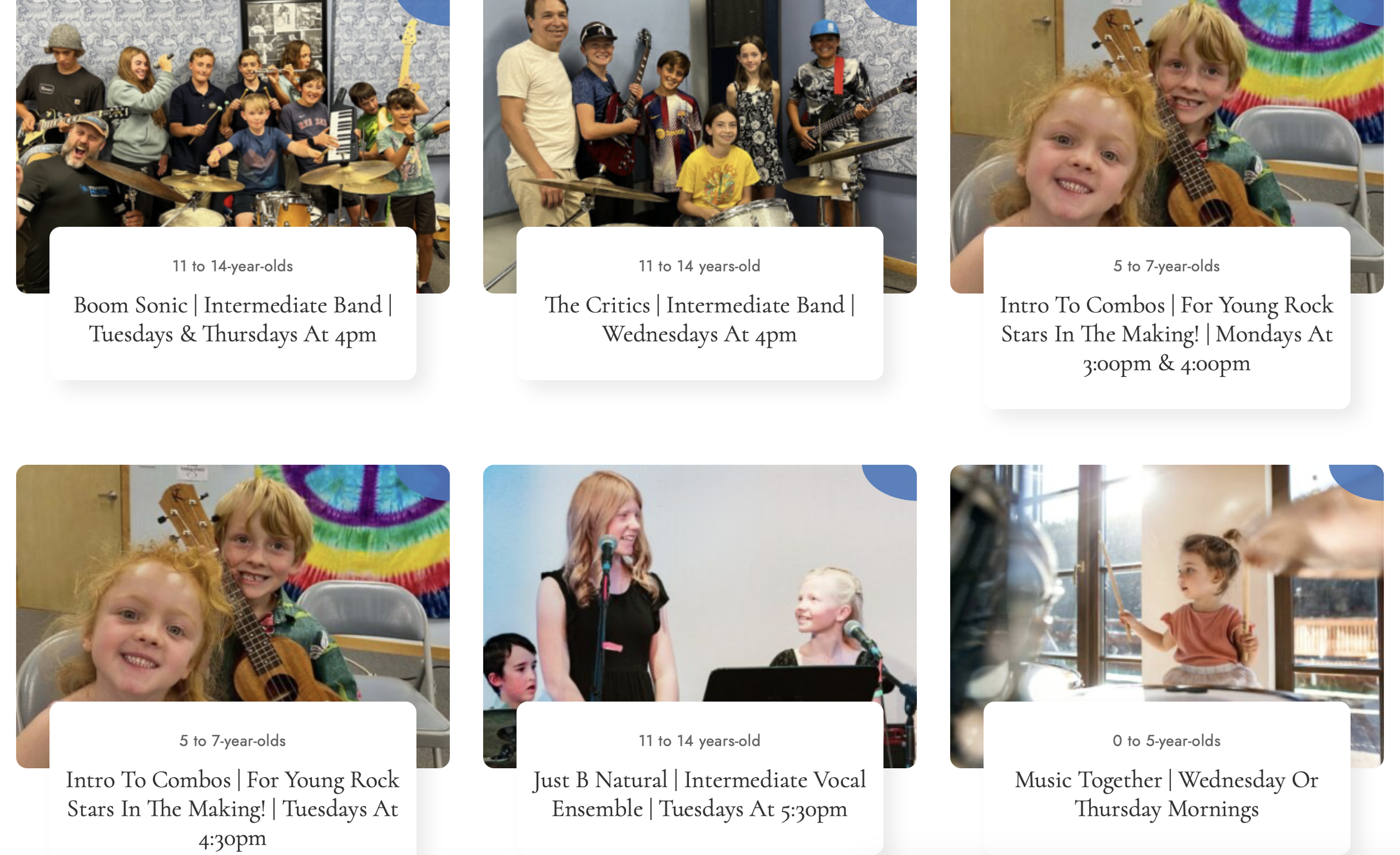
Client: stillwater Music SCHOOL
Audiences: Students, parents, donors, instructors, job seekers
Goals: Increase visibility
Objectives: To find content gaps, assess findability, quality of content, and effectiveness of course purchase process
Actions: Analyzed site content and summarized actionable recommendations.
Deliverables: Audit checklist with detailed analysis, content inventory, SEO analysis, sitemap
Findings:
Strengths: Homepage clearly conveys the mission. Tone is welcoming and consistent. The content is very scannable. Human-centered language is well-used across the site. CTAs are clear and emotionally appropriate. Visuals enhance content. Program descriptions are clear. Audiences (students, donors, parents) are clearly served. Strong directional guidance.
Opportunities: Some content is outdated or misdirected. Lacks personal stories/testimonials. Readability is too high-level in places. No sitewide search tool. The “What We Do” and “Our Programs” menu items are somewhat redundant. No entry point for job seekers. Headlines lack punch. No personal testimonials or personal stories. Not easy to view the class schedule. Keyword visibility has dropped sharply since Sept 2024. Missing/empty H1 tags on many pages. Meta descriptions are missing on most pages. Images lack alt text, and many are out of focus.
Recommendations:
Add Personal Stories & Testimonials
Collect and feature stories from students, parents, or teachers with names, photos, and quotes to build trust and engagement.Fix SEO Structure & Metadata
Ensure every page has a proper <h1>, add missing meta descriptions, and improve alt text for all meaningful images to boost search visibility.Improve Readability Across Pages
Simplify language to a 6th-grade reading level where appropriate—especially on staff, instructor, and instrument pages.Consolidate and Streamline Navigation
Merge redundant menu items (like “What We Do” and “Our Programs”), and remove unnecessary pages like the separate social media page under “About.”Add Search Functionality & Job-Seeker Entry Point
Implement a sitewide search tool and create a clear, optimized pathway for job seekers with a dedicated “Work With Us” page.
Client: sparrow Health system’s bariatric department

Make Visitors Comfortable
The new site does a much better job explaining the bariatric treatment process and preparing patients.
Audience: Prospective bariatric patients
Goals: Increase visibility and patient conversions
Objectives: To find content gaps, help the department better explain the treatment process, and prepare patients.
Actions: Established analysis criteria, analyzed site content, and summarized actionable recommendations.
Deliverables: Slide deck, website copy
Findings:
Strengths: On the positive side, the site's tone was warm and welcoming. The videos were informative and offered important social proof. The content broke myths about bariatric treatment. The content was also very scannable and readable.
Opportunities: On the negative side, the videos were too long and didn’t clarify staff roles. There was a lack of content on costs and safety risks, which were big concerns for patients. The health assessment was not robust and could mislead patients about eligibility. There was a disconnect between what the department offered and what patients needed to prepare for the long treatment process.
Recommendations:
Make Videos Easier to Consume
Shorten the videos to ~ 2 minutes and ensure essential content is also offered in text format.
Improve Content Flow and Hierarchy
Explain the process more comprehensively with better content bridging and an information hierarchy.
Make Social Proof More Visible
Pull out quotes in the testimonials to draw attention.
Deepen Rationale for Surgery
Add content on health conditions that bariatric surgery helps overcome.
Publicize Telehealth
Make sure this option is well-marketed since treatment includes a lot of follow-ups.
Get Specific
Clarify offerings like ‘24/7 support.’
Keep Site Updated Regularly
Regularly remove dated content and fill in gaps as the program evolves. Consider a quarterly schedule.
Create Content that Will Prepare Patients
Consider creating tools like a pre-op and post-op guide, FAQs, a virtual tour of facilities, and a discussion checklist for doctor visits.
Client: coverys malpractice insurance
Audience: Providers, hospital administrators, agents/brokers
Goals: Help the audiences get to know Coverys; help the agency establish itself as a thought leader.
Objectives: To answer whether the content was findable, engaging, and usable, find content gaps, and identify differentiators.
Actions: With the Screaming Frog tool, built an inventory of the pages and created a keep/edit/delete list. Established analysis criteria and analyzed site analytics and content.
Deliverables: Keep/Edit/Delete list of URLs, content audit slide deck with findings and actionable recommendations.
Findings: The audit found that the site had relevant and high-quality editorial content, but the search tool lacked enough topics to be useful. There were also a lot of content gaps and a lack of compelling imagery. The content was often targeted to a general audience, but the different segments had very distinct needs.
Recommendations:
Strengthen the About Section
To strengthen the client’s DEI and branding goals, add content on their DEI efforts, a compelling mission statement, the community work the company does, and awards and accolades. Reduce the space given to leadership photos, which were hindering their DEI branding efforts.
Strengthen Social Proof
Add testimonials to differentiate and build social proof.
Showcase New Products
Promote new products on the website to differentiate from competitors and to increase conversion of leads.
Increase Findability
Expand filtering and cross-linking to improve findability. Add a Related Content component to each page. Build a taxonomy to make sure content is categorized logically and easy to retrieve.
Search Tool
Add specific topics, content formats, and segments in the search tool.

Expand Content Search Tool
A major problem with findability on the site is that the content library has a narrow search tool. They need to expand the tool to include content formats and more popular topics.
Increase Engagement
Most pages on the current site lack compelling imagery and cross-links to related content.
Client: Myobloc (KKR)
Audience: Providers with patients who have cervical dystonia or chronic sialorrhea
Goal: To transition from Myobloc drug representatives to the website for lead generation.
Objectives: To analyze whether the content was findable, engaging, and usable and offer recommendations.
Actions: Inventoried the URLs with the Screaming Frog tool. Established analysis criteria, reviewed the competitive analysis done recently by MERGE, and analyzed site analytics. Analyzed site content and synthesized my recommendations.
Deliverables: Keep/Edit/Delete list of content, slide deck with findings and recommendations, site inventory
Findings: The company relied too heavily on print leave-behinds and, as a result, the site had scant content. Important CTAs were missing or hard to see. The ordering and reimbursement steps were not clear. Bragging points were not emphasized. Important content like injection training was missing.
Recommendations:
Transition High-quality Printed Content to Digital Channels
Now that most content will be online, transition the high-quality print assets to the website.
Fill in CTA Gaps
Add CTAs for ordering, reimbursement, and injection training.
Make Ordering and Reimbursement Clearer
Content around ordering and reimbursement is confusing.
Differentiate
Emphasize the beneficial differentiators of nonmixing drug administration.
Enhance Digitalization and Telehealth Tools
Promote these tools. They increase access and improve convenience. This includes the training videos.

Transition PDF Content to HTML
On the final site, the printed “leave-behind” materials were transitioned to HTML, making the site more robust.

Clarify Content and Boost Revenue
The final site makes the reimbursement process much clearer by breaking it down and consolidating it all in one place.

Compare to Inspire
I gave examples of excellent training resources produced by competitors like Dysport.